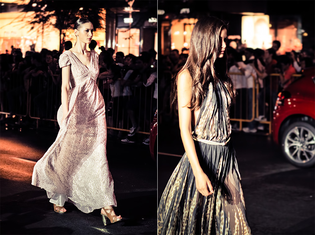
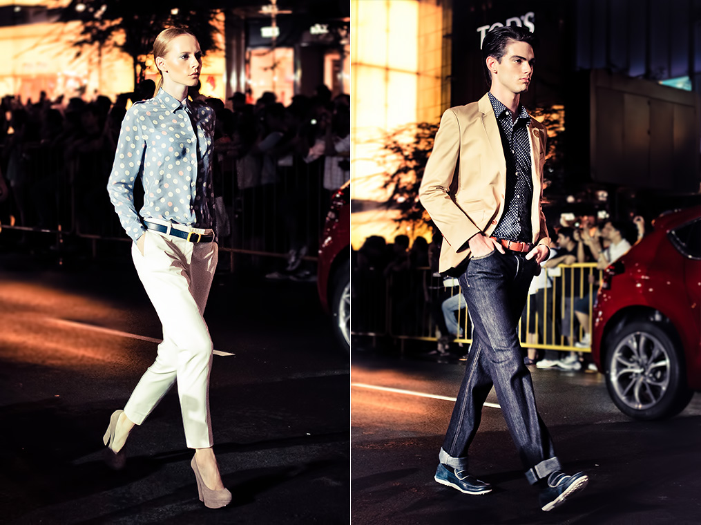
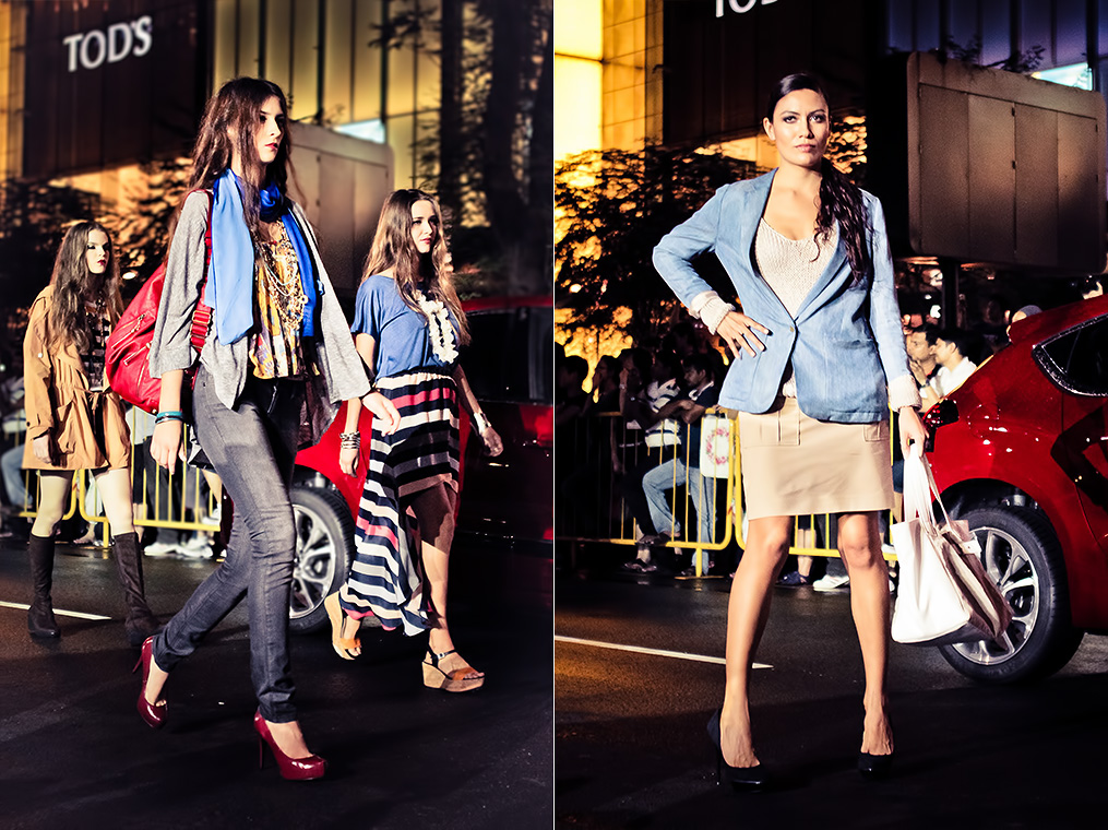
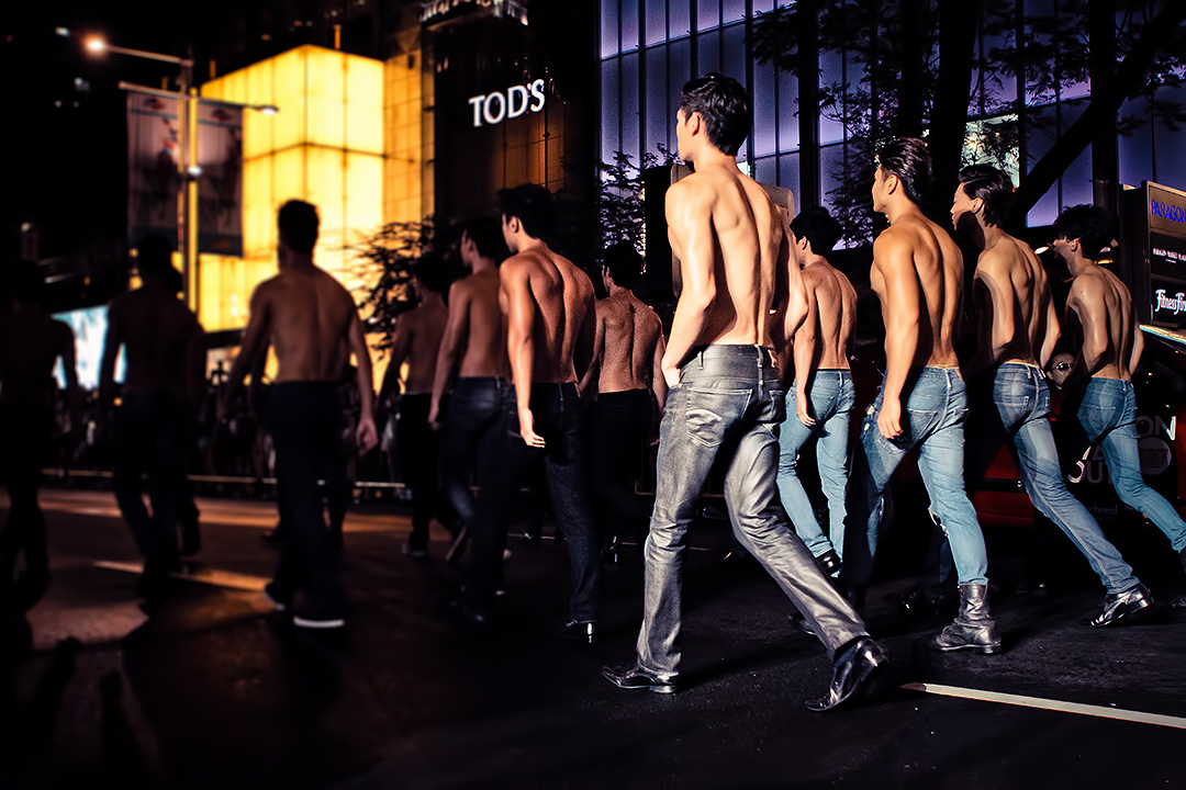
The Orchard Fashion Runway for Fashion Steps out 2012 was truly a great experience!
This year’s Orchard Fashion Runway was different from last year’s. A stretch of Orchard Road was blocked off from traffic and converted into a 600-meter long runway.
A total of 154 models made their way down the runway showcasing the latest spring and summer collections from brands; Marks & Spencer, Vivienne Westwood, Just Cavalli, Dsquared2, iCB, J.Press, Dip Drops, Robinsons, Rosebullet, Paul & Joe and Maria Grachvogel.
When the show started at about 8:40pm, it was non stop clicking the shutter for me for about an hour.


Great shots and shooting style as usual. 🙂
Thank you James!
Love the color treatment! It’s got this ‘commercial feel’ to it.
Thank you!
*sighs*Quoting from the website you lnkeid: I encourage you to experiment and see what works/looks best for you. That might be great for those of you using supercomputers to run your installation of x-plane, but it can take my computer a good five minutes to go from starting up the boot process for x-plane to sitting on the runway. I just don’t have time to experiment !Reading the comments on this blog, I think there’s a lot of frustration about x-plane. Clearly, folks want to love it, but the authors of the app make it difficult. I mean, its great that so many parts of the sim are open to developers tinkering, but to the uninitiated, the appearance of lights, this far into the development of the sim, should be something which was sorted out ages ago. There really shouldn’t be a need to tinker at this level.I get the impression that a lot of developer time is spent on improving the tools and implementation methods for graphical models in an attempt to improve the appearance of the sim. This is all appreciated, especially by those people who get involved in developing their own scenery and models. But I also get the impression that the vast majority of users don’t want to mess around with betas or coding, and that efforts to improve the basic functionality of the sim would be far more appreciated.Ben, maybe you could give us an idea of how your time is really used, and what projects there are in the pipeline, both near and long term? Maybe put the fantastic amounts of detail that you divulge in the blog into some kind of higher level context?Things which pop up again and again in the comments, include:Improved UI *World landmarksATC improvementsOnline multi-player functionality, including online ATCRealistic trafficImprovements to the way weather is rendered.etc etc. I don’t want to trawl through the blog looking for things if you are reading this, you’ll know what I mean. The point is, these are all high level issues, and this blog seems to focus on development of very granular level items which I think most users would consider nice to have s, but lower priority.Do let me know if I’m completely out of order here, Ben. I’m just telling it how I see it.* on this subject, it just occurs to me that its always difficult to get the mouse arrow to hover exactly over the + or side of a radio or nav knob. Its also frustrating that once you start twiddling a knob, you have to keep the view completely stationary until you have finished. Might it be an idea to make selection of these items slightly sticky in a sort of snap to gridlines way, if you see what I mean?
Care to share your secret to taking nice pics? xD
Haha lots of practice and a vision I guess 🙂
I want to see the front of those topless hunks! Hehehe
hey! Great Shot and Good Job!
Thank you!!
Pic no. 9 is nice!